2. Design Guidelines
2.1 MAIN LOGOTYPE
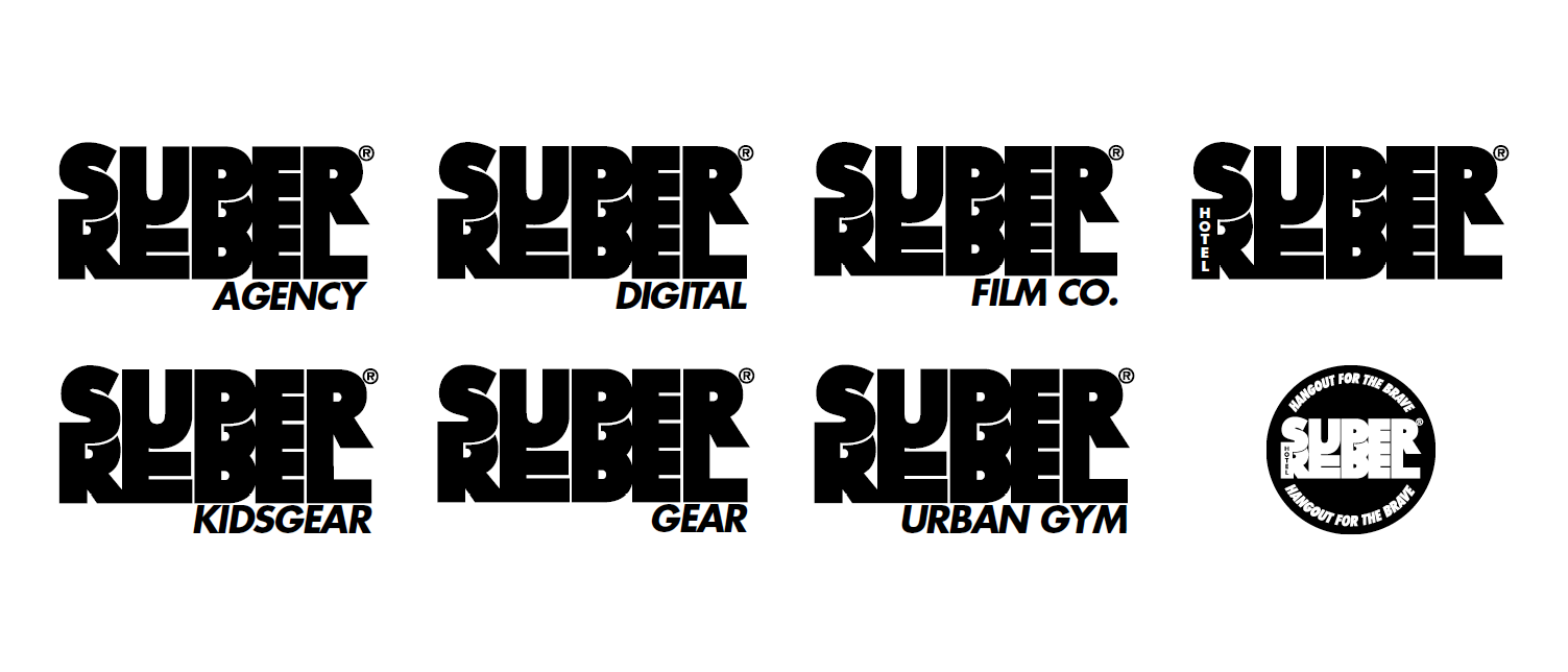
2.1 SUB LOGOS
2.3 LOGO RULES, SIZES & MARGINS

MINIMAL SIZE 35 mm / 23%
THERE IS NO MAXIMUM SIZE / THE BIGGER THE BETTER
For spacing use the examples in this guide as a reference. Feel free to rebel.
2.4 BRAVE DEVIL DEVICE
The idiom "the devil is in the details"
means that mistakes are usually made
in the small details of a project. Usually
it is a caution to pay attention to avoid
failure. An older, and slightly more
common, phrase "God is in the details"
means that attention paid to small
things has big rewards, or that details
are important. We love to do everything
perfect. So minor details are important.
That's why we chose a little devil as the
logo. The devil in the details was often
used by famous architect Mies van der
Rohe and many others. And Sympathy
for the Devil is one of the biggest hits of
the Rolling Stones. We love it and that's
why we chose the stylish character with
the 2 horns. It helps us to maintain the
highest quality standards.
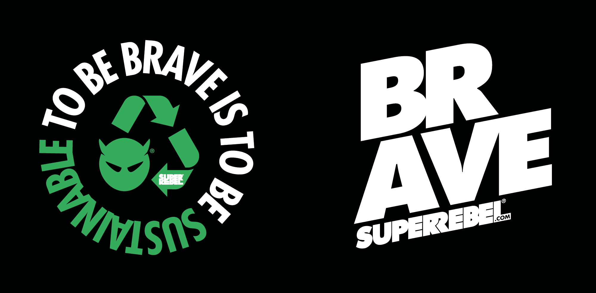
2.5 GRAPHIC DEVICES
2.6 TYPOGRAPHY
FUTURA STD EXTRA BOLD CONDENSED.
The Futura Std Extra Bold Condensed is used as the main font for headings with a leading of approximately 70-80% and a tracking of -100.
FUTURA STD EXTRA BOLD CONDENSED OBLIQUE.
The Futura Std Extra Bold Condensed is used as the main font for headings with a leading of approximately 70-80% and a tracking of -100.
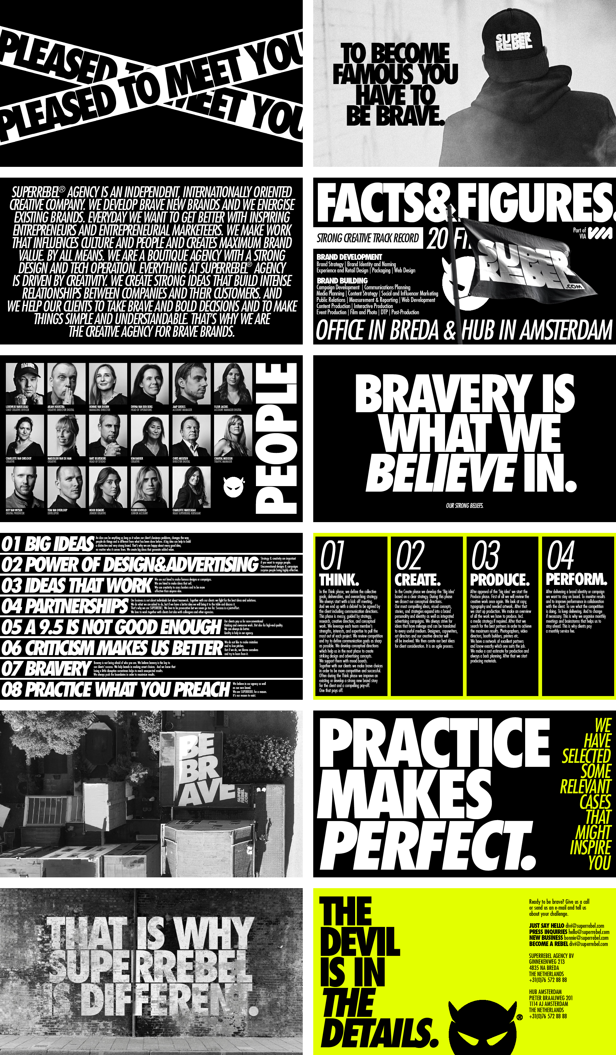
SUPERREBEL® AGENCY IS AN INDEPENDENT, INTERNATIONALLY ORIENTED CREATIVE COMPANY. WE DEVELOP BRAVE NEW BRANDS AND WE ENERGISE EXISTING BRANDS.
EVERYDAY WE WANT TO GET BETTER WITH INSPIRING ENTREPRENEURS AND ENTREPRENEURIAL MARKETEERS. WE MAKE WORK THAT INFLUENCES CULTURE AND PEOPLE AND CREATES MAXIMUM BRAND VALUE. BY ALL MEANS.
WE ARE A BOUTIQUE AGENCY WITH A STRONG DESIGN AND TECH OPERATION. EVERYTHING AT SUPERREBEL® AGENCY IS DRIVEN BY CREATIVITY. WE CREATE STRONG IDEAS THAT BUILD INTENSE RELATIONSHIPS BETWEEN COMPANIES
AND THEIR CUSTOMERS. AND WE HELP OUR CLIENTS TO TAKE BRAVE AND BOLD DECISIONS AND TO MAKE THINGS SIMPLE AND UNDERSTANDABLE. THAT’S WHY WE ARE THE ‘CREATIVE AGENCY FOR BRAVE BRANDS’.
The Futura Std Medium Condensed Oblique is used as bold body letter for our brandstory for example and has a leading of approximately 70-80% and a tracking of -40.
In the Think phase we define the collective goals, deliverables, and overarching strategy together with our client. We always start with a kick-off meeting and end up with a debrief to be agreed by the client. This phase is messy, guided by strategy, research, creative direction and conceptual work.
BRAVE BRAND SESSION
BRAND STORY
BRAND NAME DEVELOPMENT (EXCL. BUYOUT)
DEVELOPMENT PAY-OFF
DEVELOPMENT SOCIAL MEDIA STRATEGY
2.7 COLOR USAGE
CMYK 0 0 0 100
RGB 0 0 0
HEX #000000
Core Color
RGB 0 0 0
HEX #000000
CMYK 0 0 0 0
RGB 225 255 255
HEX #ffffff
Core Color
RGB 225 255 255
HEX #ffffff
CMYK 10 00 95 0
RGB 227 255 0
HEX #e3ff00
Accent Color
RGB 227 255 0
HEX #e3ff00
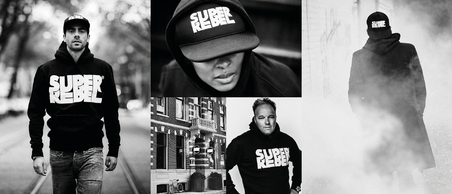
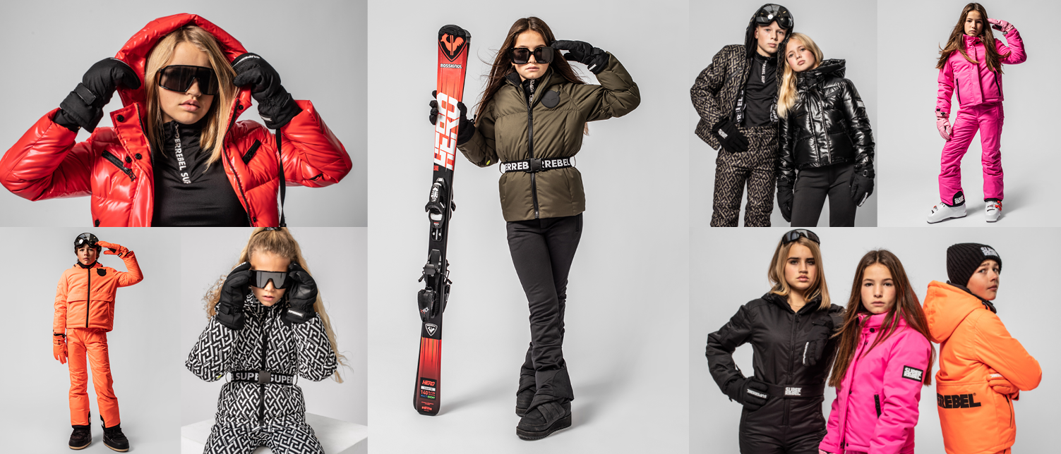
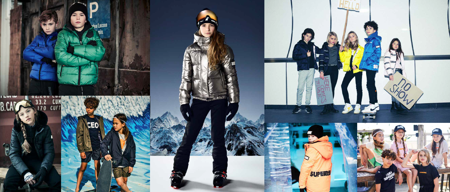
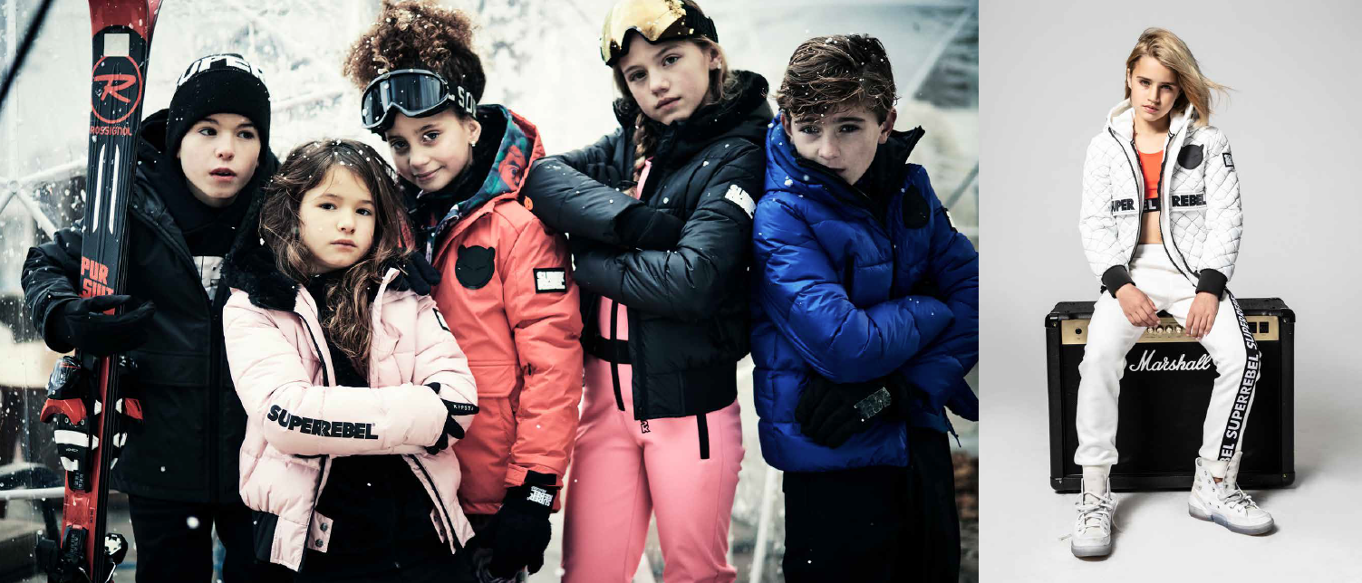
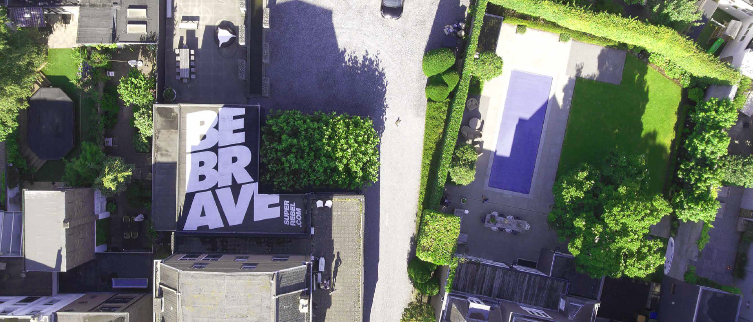
2.8 IMAGERY
BLACK & WHITE
PORTRAITS
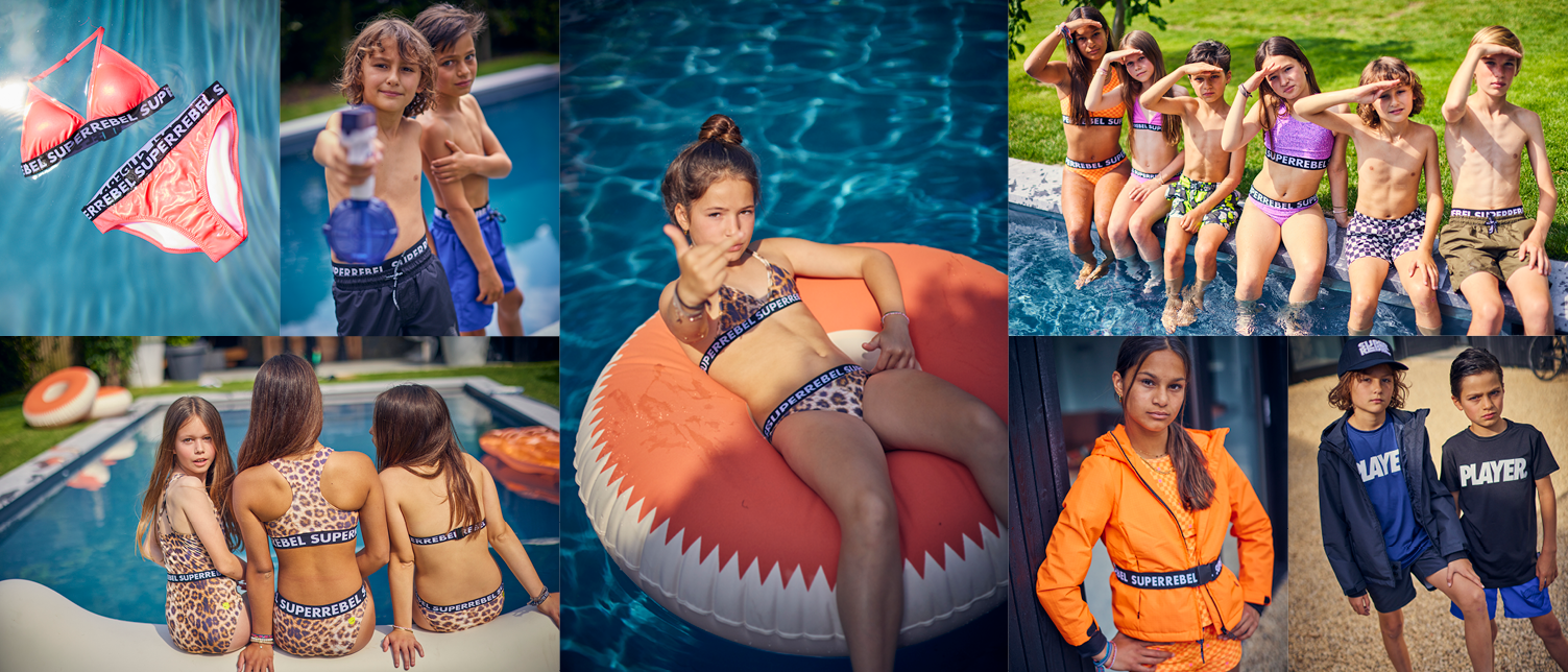
COLOR
2.9 PRESENTATIONS
